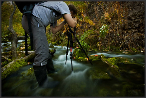
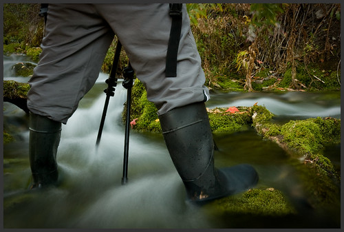
For now I present the following images
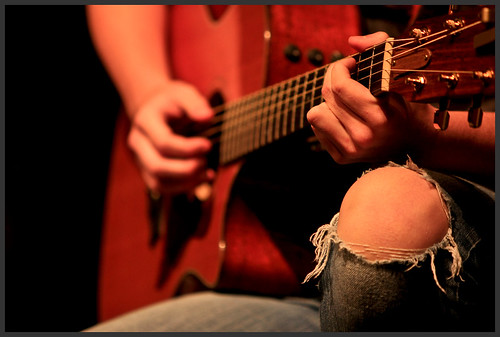
#1
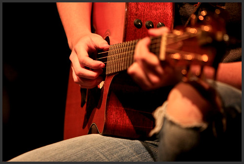
and #2
I am not sure which one of these I like more, and want some feedback... I really like her ripped knee in the first image, but then I look at the second image and I really really like the way that the tuning pegs are out of focus on the second image, and how the focal point is more along one of the third lines.. I could crop the first image a bit though... Anyways, I am interested to hear feedback on which image you like best, and also on any post-processing you think might work well.
I know that both images are very warm, but I am not sure I want to change that, as that is how the lighting looked to the eye at the actual show. These pictures are pretty much raw out of the camera, with only the black point being adjusted slightly.
Cheers!

